Category Charts (Classification)
Open in CMSClassification analysis types assign one or more category labels to every conversation — things like sentiment (Positive / Neutral / Negative), topic tagging, or a risk tier.
Overall Distribution — Category Split
The chart type adapts automatically depending on how many categories the type has:
| Number of categories | Chart shown |
|---|---|
| 5 or fewer | A doughnut chart, with the total conversation count in the center |
| More than 5 | A horizontal bar chart, showing the top 10 categories by default |
5 or fewer categories — a compact doughnut, easy to scan at a glance:
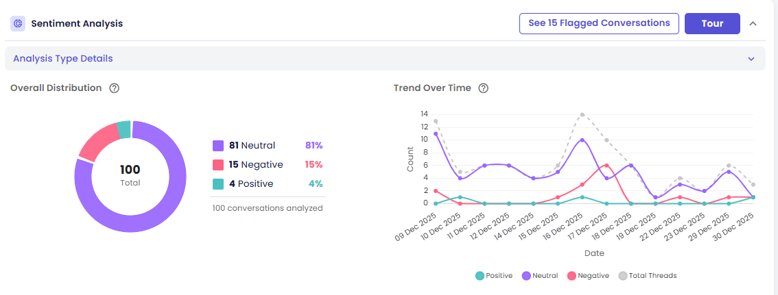
More than 5 categories — a horizontal bar chart instead, since a doughnut with many slices gets hard to read. When there are more than 10 categories, a Show All button expands the full list beyond the default top 10:
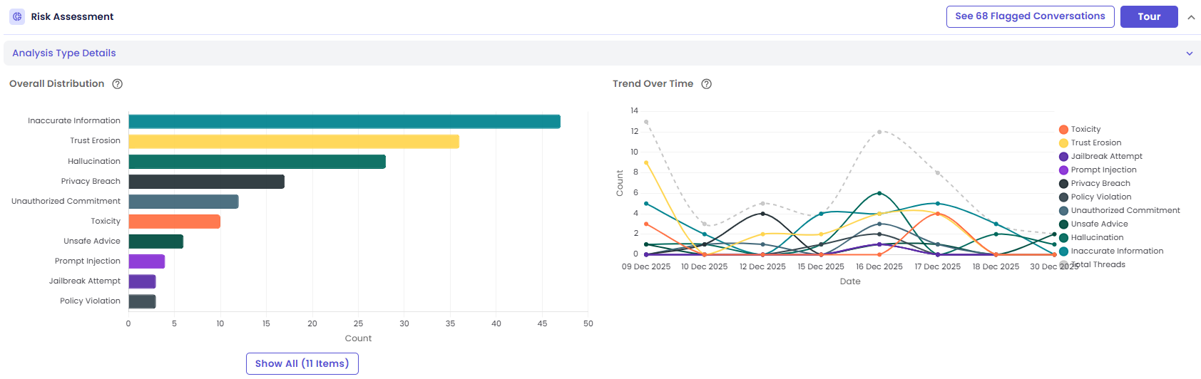
Each category uses its own configured color, or a default palette color if none was set. A legend table lists every category's name, count, and percentage.
Interactions:
- Hover a segment or bar → see its count and percentage
- Click a segment, bar, or legend row → open the drill-down drawer filtered to conversations with that category
Trend Over Time — Category Counts by Day
A multi-line chart, with one line per category.
- Categories with zero occurrences across the date range are hidden automatically, so the chart doesn't get cluttered with flat lines
- A dashed Total Threads line runs alongside for reference
- With many categories, the legend moves to the right side of the chart to keep the plot area readable
Interactions:
- Hover a point → see that day's count for that category
- Click a point → open the drill-down drawer for those conversations
- Click a legend label → show or hide that category's line, useful for isolating one or two categories in a busy chart
Next Steps
- Viewing the Conversations Behind a Chart
- Guided Tour & Help — start this card's own Tour for a step-by-step walkthrough