Yes/No Charts (Binary)
Open in CMSBinary analysis types check for a specific yes/no condition in every conversation — things like "was a complaint made?" or "does this need escalation?". Every conversation gets exactly one of two outcomes.
Each binary type gets its own result card, with the same anatomy as every other analysis type: a name and icon, a status, a Tour button, a Flagged Conversations button (when there are any), and its charts and insights below.
Overall Distribution — Outcome Split
A doughnut chart shows the split between the two outcomes across every conversation analyzed.
- The center shows the count of flagged conversations, labeled "Flagged"
- Each segment is one outcome — for example "Complaint Detected" vs "No Complaint"
- The legend next to it lists each outcome's exact count and percentage
Color Coding Depends on How the Type Was Configured
The color of each segment isn't fixed to true/false — it's fixed to favorable/unfavorable, based on how the type's "positive outcome" was configured when it was created:
When the favorable outcome is "true" — the true value is green, the false value is red:
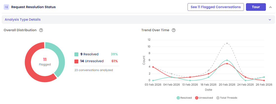
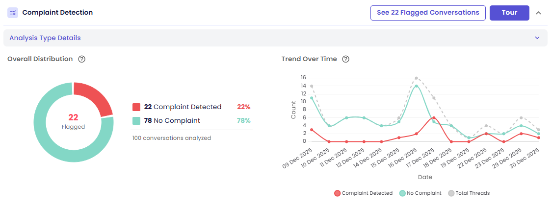
When the favorable outcome is "false" — this is the more common case for detection-style types, where finding the condition is the bad outcome. Here "true" (the condition being detected) is red, and "false" is green:
When no direction is configured — both outcomes use a neutral color scheme instead of green/red, since there's no configured "good" or "bad" side:
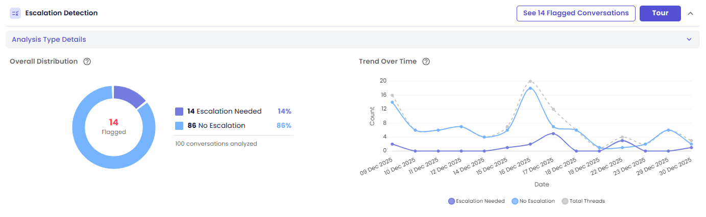
The takeaway: don't assume red always means "true" — check the legend labels. The color always tracks favorable vs. unfavorable, not the literal true/false value.
Interactions:
- Hover a segment → see its exact count and percentage
- Click a segment or its legend row → open the drill-down drawer filtered to conversations with that outcome
Trend Over Time — Outcome by Day
A multi-line chart shows how each outcome's daily count changed across the run's date range.
- One line for the favorable outcome, one for the unfavorable outcome — colored the same as the distribution chart above
- A dashed Total Threads line for reference, showing total conversations analyzed per day
Interactions:
- Hover a point → see the exact count for that date
- Click a point → open the drill-down drawer filtered to conversations from that date
Next Steps
- Viewing the Conversations Behind a Chart
- Guided Tour & Help — start this card's own Tour for a step-by-step walkthrough