Score Charts
Open in CMSScore analysis types assign a numeric value within a configured range (e.g. 1–5, or 0–100) to every conversation — things like resolution quality, effort score, or a satisfaction rating.
Overall Distribution — Score Buckets
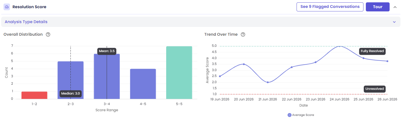
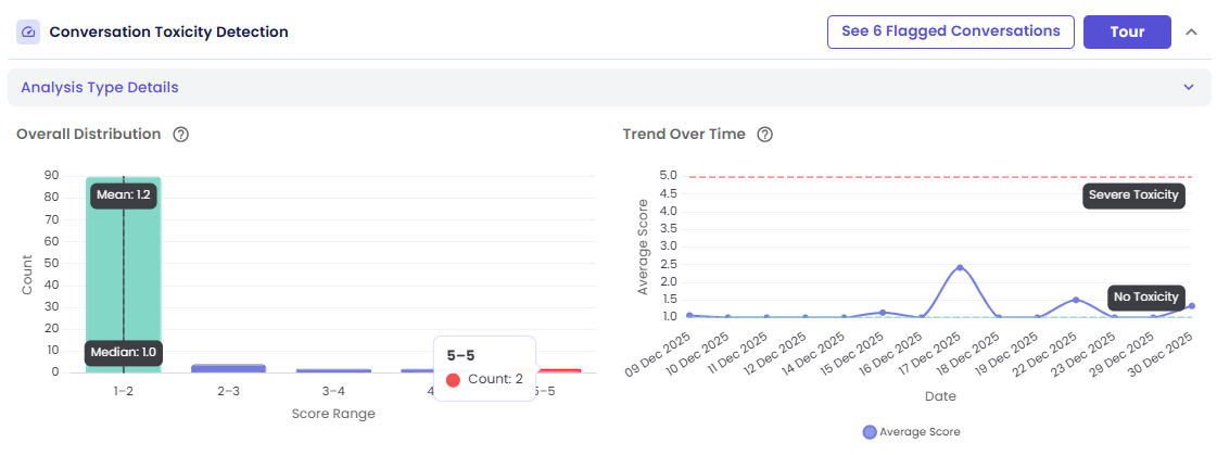
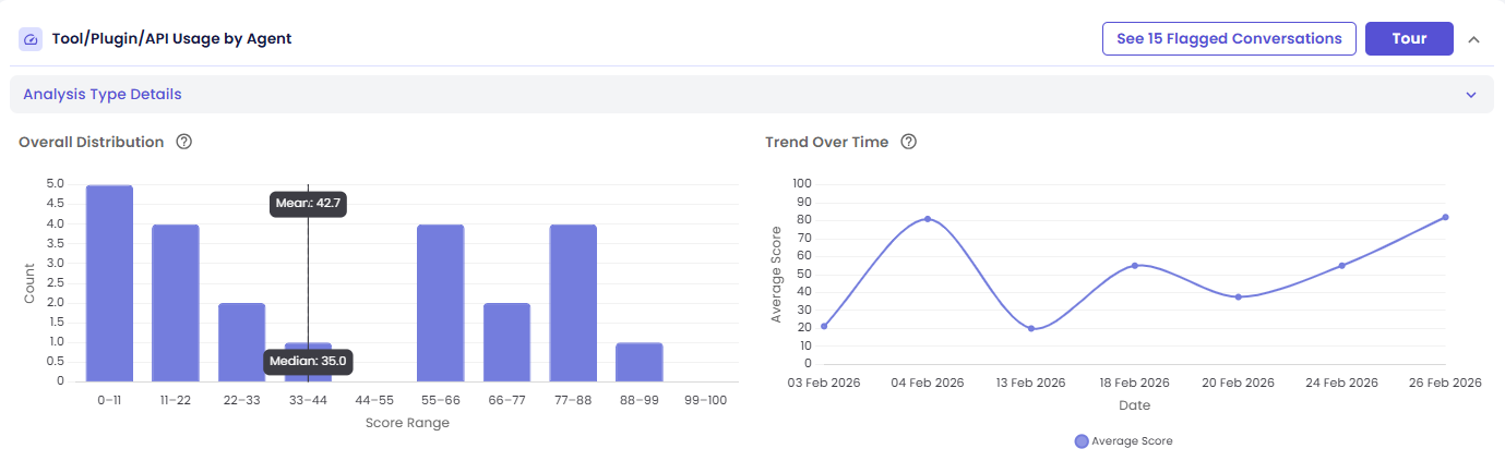
A vertical bar chart shows how scores are spread across ranges ("buckets") within the configured scale.
- Bar height = how many conversations fall in that score range
- A solid vertical line marks the Mean score, labeled with its exact value
- A dashed vertical line marks the Median score, labeled with its exact value
- Bar color shifts along a gradient based on how the type was configured — see below
Color Gradient Depends on Direction
Higher is better — bars shift from red (low scores) toward green (high scores). Optional dashed threshold lines can mark named boundaries, like a "Fully Resolved" ceiling or an "Unresolved" floor:
Lower is better — the gradient is reversed: low scores are green, high scores are red. This is typical for risk or severity scores, where a low number is the good outcome:
No direction configured — bars use a neutral gray/purple gradient instead, since there's no configured "better" direction:
Interactions:
- Hover a bar → see the score range and how many conversations fall in it
- Click a bar → open the drill-down drawer filtered to conversations with scores in that range
Trend Over Time — Average Score by Day
A line chart shows how the daily average score moved across the run's date range.
- The main line is the average score per day
- Optional dashed threshold lines mark configured boundaries (their labels carry over from the distribution chart, e.g. "Fully Resolved" / "Unresolved")
Interactions:
- Hover a point → see that day's average score and total conversations
- Click a point → open the drill-down drawer filtered to conversations from that date
Next Steps
- Viewing the Conversations Behind a Chart
- Guided Tour & Help — start this card's own Tour for a step-by-step walkthrough