Overall Insights
Open in CMSWhen a run includes two or more analysis types, and at least some of them complete successfully, the system generates a set of cross-analysis insights that sit above the individual result cards. Instead of looking at each analysis type in isolation, this card looks for patterns that show up across multiple dimensions at once.
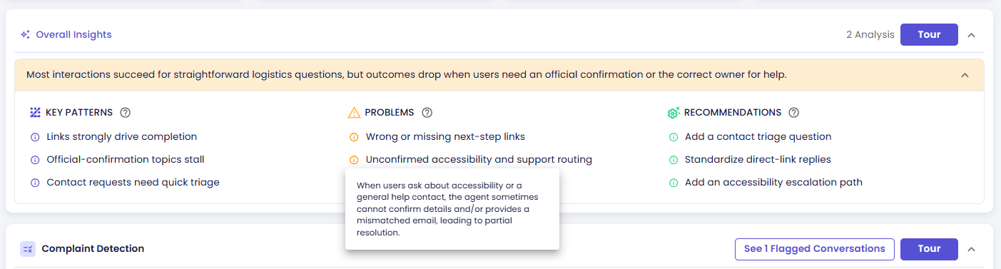
The card header badge shows how many analysis types contributed (e.g. "2 Analysis", "3 Analysis").
Overall Insights only appears once every analysis type in the run has finished. If the run was stopped or is still processing, you won't see this card yet — see Run Summary & Actions for what's shown in that case.
The Four Sections
| Section | What it contains |
|---|---|
| Conclusion (the banner) | The AI's top-level synthesis across all analysis types — what the combined data says overall |
| Key Patterns | Observable trends and notable behaviors detected across multiple analysis dimensions at once |
| Problems | Friction points or failures that span multiple analysis dimensions, each with a severity indicator |
| Recommendations | Specific, actionable suggestions the AI derived from the combined findings |
Conclusion Color Coding
The conclusion banner's background color reflects the AI's overall assessment:
| Color | Meaning |
|---|---|
| ⬤ Green | Results clearly lean positive |
| ⬤ Orange/Yellow | A significant mix of positives and negatives |
| ⬤ Red | Results clearly lean poor |
| ⬤ Gray | Factual — no clear positive or negative signal either way |
If a run's analysis types produce more than one conclusion, the banner shows the most negative outcome among them — so if even one dimension looks bad, that's what surfaces first.
Problem Severity Levels
Each item under Problems is tagged with a severity level. Instead of a separate label, this shows up as the color of the ⓘ info icon next to the item — the more alarming the color, the more severe the problem:
| Severity | Meaning |
|---|---|
| ⬤ Low | Minor, minimal impact on users |
| ⬤ Medium | Notable, affects a portion of users |
| ⬤ High | Significant, broad impact on users |
| ⬤ Critical | Severe, requires immediate action |
Medium and High share the same orange icon color — tell them apart by the severity word itself, not the color.
Getting the Detail Behind an Item
Every item under Key Patterns, Problems, and Recommendations has its own ⓘ info icon. Click it to open a popover with the fuller explanation behind that specific point — the short list text is a headline, the popover is the "why":
This is the fastest way to understand why the AI called something out, without opening the full guided tour.
Responsive Layout
The four sections rearrange depending on how much screen width is available:
- Wide screens — all sections shown side by side in a grid
- Medium screens — a two-tab layout: "Key Patterns" and "Problems & Recommendations"
- Narrow screens, or with the chat panel open — a three-tab layout with a separate tab for each section
Next Steps
- Viewing the Conversations Behind a Chart — how to get from any of the patterns or problems above to the actual conversations behind them
- Explore the result card for each analysis type that contributed: Binary · Score · Classification · List
Related Pages
- Run Results: Overview Tab
- Run Summary & Actions
- Guided Tour & Help — start the Overall Insights tour from the card's Tour button